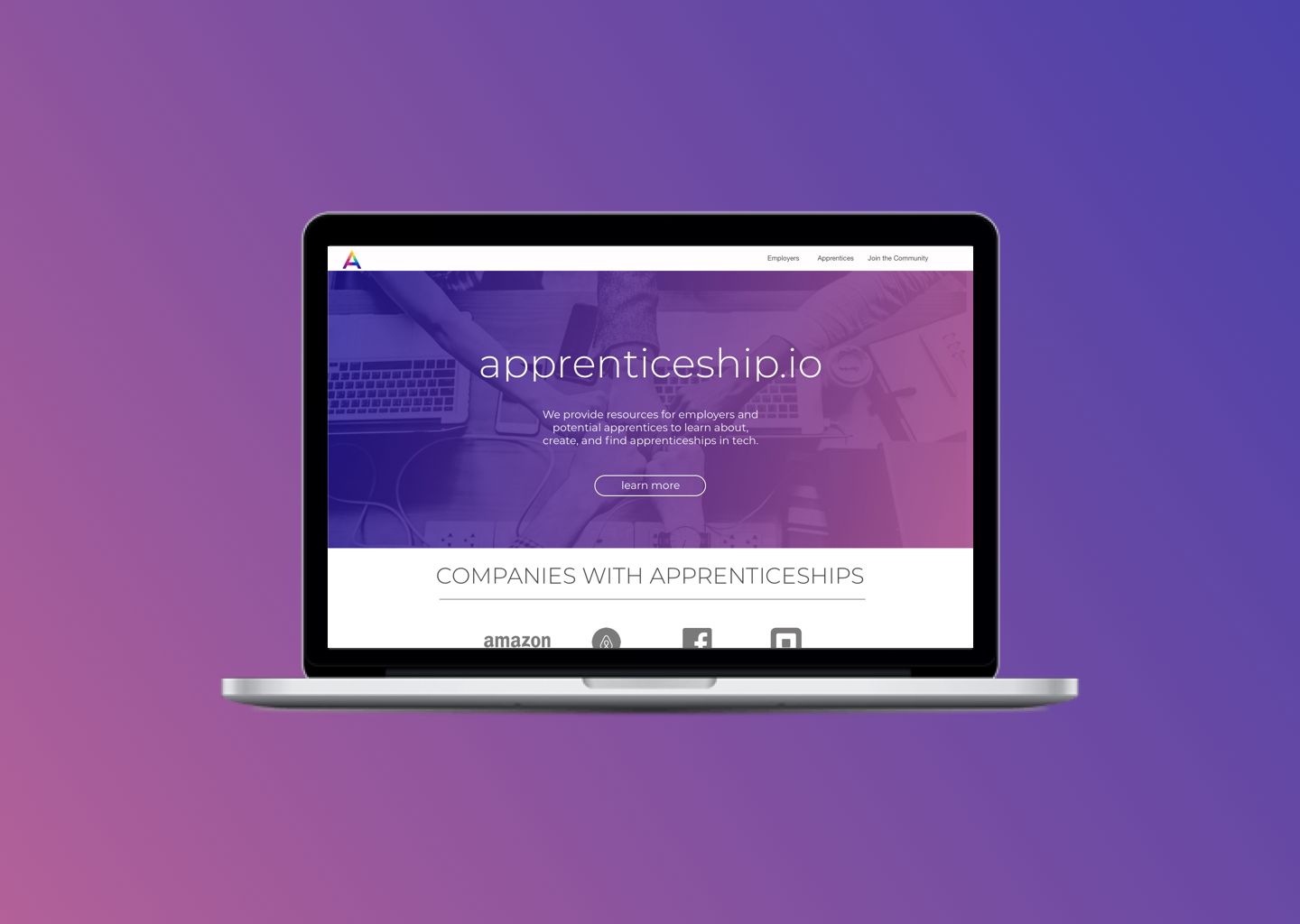
Consulting for Apprenticeship.io

Consulting for Apprenticeship.io
Consulting for Apprenticeship.io
UX Lead - UX Research - UX Design - Visual Design
The Problem
Employers need resources and encouragement to create apprenticeships at their companies.
Background
Apprenticeship.io is a start up that encourages tech companies to create apprenticeships and provide resources for potential apprentices. Internships in the tech industry are geared towards current Computer Science students or recent graduates. There are not very many entry level opportunities for non traditional candidates who are self taught, attended a web development immersive, or are making career transitions. Many companies have goals of increasing diversity within their companies and retaining employees that want to change positions. Non traditional candidates are more diverse, offer previous job experience in other fields that translate to tech, and create a more inclusive workplace.
The Goal
To create a resource where employers can learn how to set up their own apprenticeship, see other companies with apprenticeships, and be inspired to create their own program.
Research
User Interviews
What we learned from user interviews with employers that want to create apprenticeships.
They are unsure where to start.
They would like guidelines on how to set up their own apprenticeship.
They would like to know what other companies have apprenticeships.
What we learned from user interviews with past, current, and potential apprentices.
They want to know what companies currently have apprenticeships.
They want to know about past apprentices and where they are now.
Personas
After learning what potential users of Apprenticeship.io were looking for I distilled those needs and represented them as personas to make sure the designs accomplished our goals.

Julian
They/them - Manager at a large tech company - 33
Motivations: Wants to increase diversity at their company and learn about other employers that have apprenticeships.

Jody
She/her - 44 - Founder of a start up
Motivations: She would like a guide to help her set up an apprenticeship at her company.

Owen
He/him - 30 - Former nurse transitioning into engineering
Motivations: He would like to hear the stories of apprentices to see if it would be a good fit for his career path.
Wireframes & Visual Design
Wireframes
Working collaboratively with the founder, developers, former & potential apprentices, and employers interested in apprenticeships, I lead a meeting to decide on the main components of the website that I turned into low fidelity prototypes later that day.
Low Fidelity Prototypes
I took the components I discussed with the stakeholders in user interviews and team meetings and created low fidelity prototypes to test the layout of the website.
Working closely with the founder of the company, we decided on our goals for the visual design:
Modern
Clean
Trustworthy
Inclusive
Exciting
Colorful
Circular Shapes
Logo Design
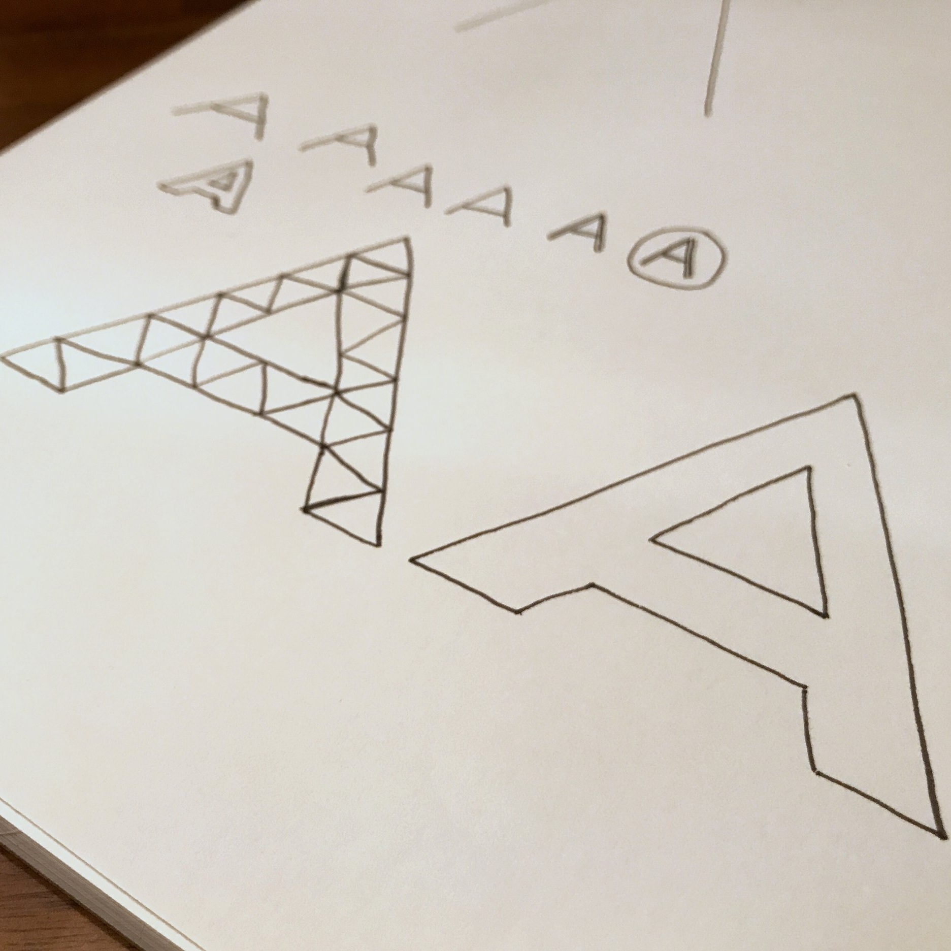
The Design of the Apprenticeship.io logo needed to represent the qualities and goals of the company. Much like the overall UI Design for the Website, The company founder and I wanted the logo to evoke feelings of excitement, trust, and inclusivity. I accomplished this by making sure the logo was colorful and eye catching, had clean modern lines, yet was a very classic shape and an easily identifiable “A”.
High Fidelity Prototype - First Iteration
Results of the First User Test
What went well:
Users liked seeing what companies had apprenticeships through the interactive map feature.
Testimonials of current and previous apprentices were an engaging way for users to connect with apprentices.
Creating the Hall of Fame entry form was easy to fill out if they wanted to share their story.
They loved seeing photos of everyone involved with apprenticeships.
Things to improve:
Content writing was unclear. Titles were too long and some terms needed more descriptions
The sizing of many of the items felt too large and some icons were distracting.
High Fidelity Prototype - Second Iteration
Interactive Prototype Videos
Final Results
Results of the Second User Test
Improvements from the first prototype:
Clean modern UI that was easy to use
Content writing was encouraging, clear and easy to read
Things to improve:
Include the numbers of success rates on the landing page and the employer page. Users wanted to quickly know the financial benefits and retention rates of apprenticeships without having to navigate to other pages.
What i learned
I learned how to balance the needs of two different types of users in one cohesive site, I experienced how users would like information displayed within a design, and I improved my visual design skills while creating every icon and component.


