Instagram Hashtag Groups
Instagram Hashtag Groups

Instagram Hashtag Groups
UX Research - UX Design - Visual Design
The Problem
Instagram users want to connect with new followers and do so through hashtags. However, entering hashtags can be tedious, easy to mistype, and not accessible for users who experience pain while typing.
The Background
Since hashtags can be followed and searched, many users follow hashtags that align with their interests. Wether it is for professional or personal reasons, users on Instagram are looking to connect with others and often reach more people when including hashtags in their posts. However, typing each hashtag one by one can take a lot of time, typos are easy and can render that hashtag useless, and requiring hashtags to be typed every time can make them less accessible for people with rheumatoid arthritis and repetitive stress injuries. This has caused users to pay for other apps to store and enter hashtags into their posts or to find other work arounds. There’s a need for an improved method for entering hashtags so users can connect with their communities.
The Goal
To create an easier and more accessible way to organize and include hashtags in posts so users can connect with followers.
Research
User Experience Survey & User Tests of The Original App
I created a survey to discover the goals and pain points of Instagram users around hashtags.
Their main motivation:
To connect with current and potential followers by using hashtags.
Their main frustrations:
The time it took to type hashtags, many of them referred to it as, “tedious”.
The common problem of making a typo and therefore using the wrong hashtag.
It was easy to forget hashtags that they wanted to use. Many used other apps to organize their hashtags or kept them on a separate note to copy and paste them.
Some felt that hashtags were visually distracting from their photos.
Users with rheumatoid arthritis and repetitive stress injuries found it difficult and painful to enter the hashtags they wanted to use.
Personas
After distilling my findings from the user survey and test, I created personas for reference to ensure all of the users needs were met.

Jules
She/her - 30 - Architect
Motivations: She has rheumatoid arthritis(RA). Her RA makes it difficult to type on her phone so she types her hashtags into an email on her desktop, emails it to herself, and pastes in into the Instagram app on her phone in order to connect with other users.

Cameron
They/them - 27 - Artist
Motivations: They find it tedious to type everything manually, are concerned that they might mistype or forget to use some helpful hashtags.

James
He/him - 42 - Bar owner
Motivations: He pays for and uses an additional app to organize hashtags and paste them into Instagram to connect with his customers.
Competitive Analysis
Work arounds people are currently using:
Notes app
Emailing hashtags to themselves (typing on a laptop and pasting them into the app on their cell phone)
Apps that store hashtags, and can paste into the Instagram app. (Ex: Preview App, Hot and Hashtags)
Prototype
Low Fidelity Prototypes
I created low fidelity prototypes to test layout and user flows. Here is a sample of some of them.
High Fidelity Prototypes and the Instagram Features that Inspired them
To ensure new features I created were consistent with Instagram’s UI patterns, I took inspiration from analogous components that are currently in the app.
Instagram’s “Add Location” feature for a photo in the post flow:
In the current Instagram app, the flow for adding your location to a post was easy to discover and fill out. Typing isn’t required but is still an option. I felt a similar set up would lend itself nicely for adding hashtags to a post.
My “Add Hashtags” feature:
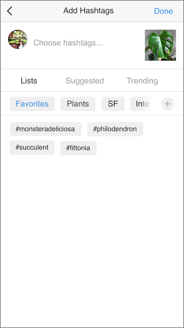
For my “Add Hashtags” feature, I put it on the same screen as Instagram’s “Add Location” component. I included a similar ability to be able to tap on hashtags you would like to to include. This reduces typos, ensures users don’t forget their favorite hashtags, and makes it more accessible for users that experience difficulty or pain while typing. Users can create different groups of hashtags based on a category or they can add the ones they use the most to their “favorites” list. If users want to add all of the hashtags in one of the groups they can save even more time by double tapping on the name of the hashtag group list.
Instagram’s feature to save photos:
Users can save photos into different collections. When a user wants to save a specific photo, they click on a bookmark icon and it will automatically be saved. If they press and hold the icon, a selection of collections the user has created will appear from from the bottom of the screen. After the user selects a collection to save the photo to, the collection choices collapse and their action is confirmed in a message at the top of the screen.
Instagram’s feature to follow a hashtag:
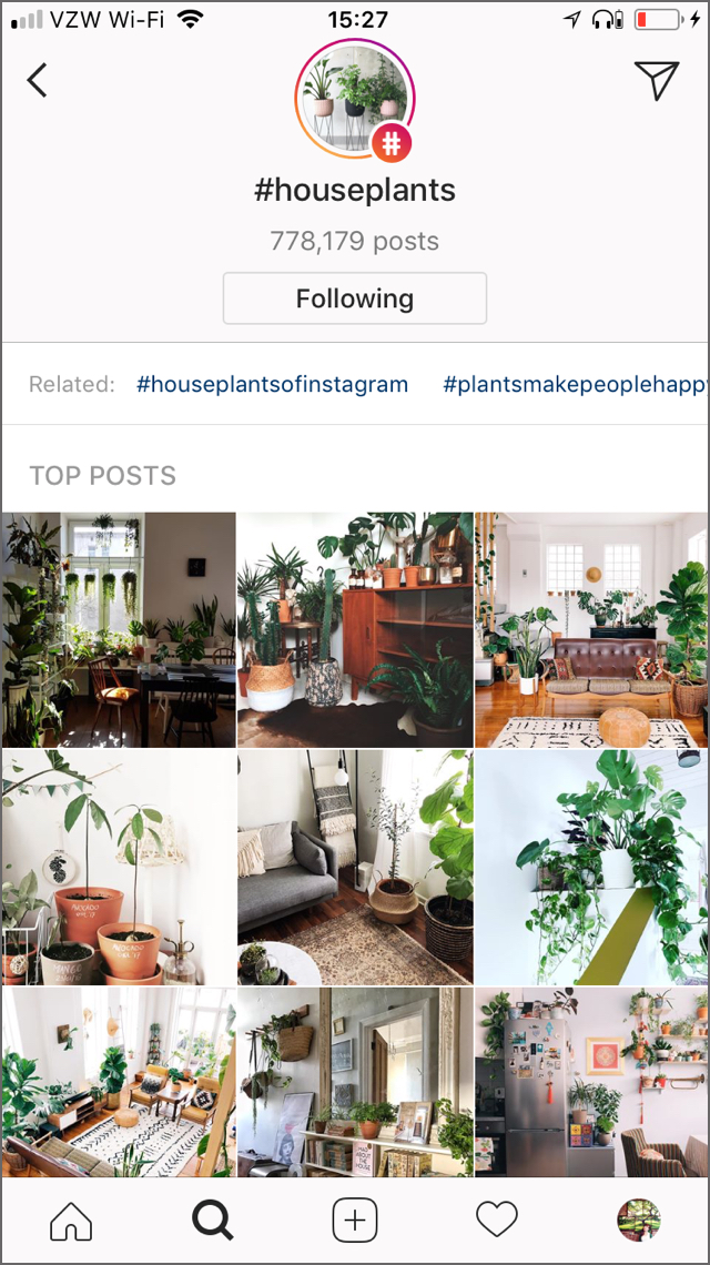
Users can click on the hashtag they’re interested in and view a page dedicated to that hashtag and press the follow button.
My feature to add a hashtag to a group:
To create the ability to add a hashtag to one of your hashtag groups so it’s easier to add hashtags to a post, I took inspiration from Instagram’s features to follow a hashtag and to save a photo to a collection.
When the user navigates to a hashtag page, they can click the plus sign button next to the follow button. The hashtag groups the user has created will slide up from the bottom of the screen, they can choose which group to add it to, and then their action will be confirmed at the top of the screen in a message.
Interactive Prototypes
How to use hashtag groups when adding hashtags to a post.
How to save hashtags to a group
Results
Instagram Hashtag Groups Feature Findings

To measure results, I had users rate their experience when using the original Instagram app and the interactive prototype of my design. I wanted to make sure the new feature did not interrupt the rest of the post flow on Instagram which users rated highly and make sure that I made it more enjoyable for them to enter hashtags on their posts. I had them evaluate things on a scale of 1 - 5, 1 being very frustrating and 5 easy & enjoyable. The addition of hashtag groups increased ease and enjoyability by 25% - 40%.
What went well:
Users understood how to add hashtags to their posts in the new feature and felt it not only fit in but improved the post flow.
They liked having the ability to add hashtags by tapping one at a time or an entire list. They found it less tedious than typing and more accessible.
What can be improved:
the plus button I used to add a hashtag to a hashtag group was not easily discoverable. Users were unsure what it was until they pressed it. Including a notification pointing out the new feature or creating an overlay to highlight the new feature would help users know it’s functionality. It may also be better to change the icon from a plus sign to a hashtag or a word describing it’s function.
What I learned:
I had the opportunity to work closely with users who have rheumatoid arthritis and repetitive stress injuries. It gave me a unique insight to their experience using mobile apps. They have found ways to reduce their painful experience so that they can enjoy the app and connect with their communities. Making hashtags more accessible also makes it easier for other Instagram users to quickly and confidently share images. The user tests of my feature exposed how certain icons are interpreted and I learned how to break down certain ideas into smaller user tests to be completed early and often in the process.


